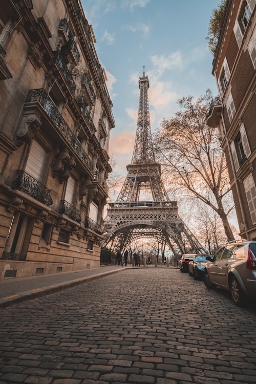
Basic Usage
Click the image to zoom in.
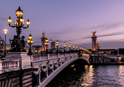
Preview
Code
<%= render HakumiComponents::Image::Component.new(
  src: "https://images.unsplash.com/photo-1499856871958-5b9627545d1a?w=400",
  alt: "Paris cityscape",
  width: 200
) %>
Fault Tolerant
Load failed to display image placeholder using the fallback prop.

Preview
Code
<%= render HakumiComponents::Space::Component.new(size: :large) do |space| %>
  <% space.with_item do %>
    <%= render HakumiComponents::Image::Component.new(
      src: "data:image/png;base64,invalid",
      fallback: "https://images.unsplash.com/photo-1523906834658-6e24ef2386f9?w=400",
      alt: "Image with fallback (Venice)",
      width: 200
    ) %>
  <% end %>
  <% space.with_item do %>
    <%= render HakumiComponents::Image::Component.new(
      src: "data:image/png;base64,invalid",
      alt: "Broken image (no fallback)",
      width: 200,
      preview: false
    ) %>
  <% end %>
<% end %>
Progressive Loading
Progressive loading with blur placeholder while image loads.

Preview
Code
<div style="display: flex; flex-direction: column; gap: 16px; align-items: start;">
  <%= render HakumiComponents::Image::Component.new(
    src: "https://images.unsplash.com/photo-1451187580459-43490279c0fa?q=80&w=4000&auto=format&fit=crop",
    alt: "High Resolution Universe",
    width: 400,
    placeholder: true,
    id: "progressive-demo-image"
  ) %>

  <%= render HakumiComponents::Button::Component.new(type: :primary, id: "progressive-demo-reload") do %>
    Reload Image
  <% end %>
</div>

<script>
  (() => {
    const button = document.getElementById("progressive-demo-reload")
    const imageWrapper = document.getElementById("progressive-demo-image")
    if (!button || !imageWrapper) return

    button.addEventListener("click", () => {
      const img = imageWrapper.querySelector("img")
      if (!img) return

      imageWrapper.classList.remove("hakumi-image-loaded", "hakumi-image-error")
      const baseUrl = img.src.split("&t=")[0]
      img.src = `${baseUrl}&t=${Date.now()}`
    })
  })()
</script>
Multiple Image Preview
Click the left and right switch buttons to preview multiple images.


Code
<%= render HakumiComponents::Image::PreviewGroup::Component.new do |group| %>
  <% group.with_image(
    src: "https://images.unsplash.com/photo-1499856871958-5b9627545d1a?w=200&h=200&fit=crop",
    alt: "Paris",
    width: 150
  ) %>
  <% group.with_image(
    src: "https://images.unsplash.com/photo-1523906834658-6e24ef2386f9?w=200&h=200&fit=crop",
    alt: "Venice",
    width: 150
  ) %>
  <% group.with_image(
    src: "https://images.unsplash.com/photo-1552832230-c0197dd311b5?w=200&h=200&fit=crop",
    alt: "Rome",
    width: 150
  ) %>
  <% group.with_image(
    src: "https://images.unsplash.com/photo-1534351590666-13e3e96b5017?w=200&h=200&fit=crop",
    alt: "Amsterdam",
    width: 150
  ) %>
<% end %>
Custom Preview Image
You can set a different preview image (higher resolution) using preview_src.

Preview
Code
<%= render HakumiComponents::Image::Component.new(
  src: "https://images.unsplash.com/photo-1502602898657-3e91760cbb34?w=200&h=150&fit=crop",
  preview_src: "https://images.unsplash.com/photo-1502602898657-3e91760cbb34?w=1200",
  alt: "Paris - Eiffel Tower (thumbnail shows small, preview shows large)",
  width: 200
) %>
Controlled Preview
You can control preview programmatically using the JavaScript API.
Preview
Code
<style>
  .controlled-preview-demo {
    display: flex;
    align-items: center;
    gap: 16px;
  }
</style>

<div class="controlled-preview-demo">
  <%= render HakumiComponents::Image::Component.new(
    src: "https://images.unsplash.com/photo-1534351590666-13e3e96b5017?w=400",
    alt: "Amsterdam canals",
    width: 200,
    id: "controlled-image"
  ) %>

  <%= render HakumiComponents::Button::Component.new(
    type: :primary,
    id: "open-preview-btn"
  ) do %>
    Open Preview Programmatically
  <% end %>
</div>

<script>
  (() => {
    const button = document.getElementById("open-preview-btn")
    const image = document.getElementById("controlled-image")
    if (!button || !image) return

    const wire = () => {
      const api = image.hakumiComponent?.api
      if (!api) return false

      button.addEventListener("click", () => api.open())
      return true
    }

    if (wire()) return

    const onRegister = ({ detail }) => {
      if (detail.id !== image.id) return
      if (wire()) window.removeEventListener("hakumi-component:registered", onRegister)
    }

    window.addEventListener("hakumi-component:registered", onRegister)
  })()
</script>
Custom Preview Mask
Customize the preview mask content by passing a block.
Click to Preview
Code
<%= render HakumiComponents::Image::Component.new(
  src: "https://images.unsplash.com/photo-1467269204594-9661b134dd2b?w=400",
  alt: "Barcelona - custom mask example",
  width: 200
) do %>
  <div style="display: flex; align-items: center; gap: 8px;">
    <%= render HakumiComponents::Icon::Component.new(name: :eye, size: 16) %>
    <span>Click to Preview</span>
  </div>
<% end %>
Mask Closable
Set mask_closable: true to close the preview when clicking on the background.

Preview
Code
<%= render HakumiComponents::Image::Component.new(
width: 200,
src: "https://images.unsplash.com/photo-1579546929518-9e396f3cc809?q=80&w=2070&auto=format&fit=crop",
mask_closable: true
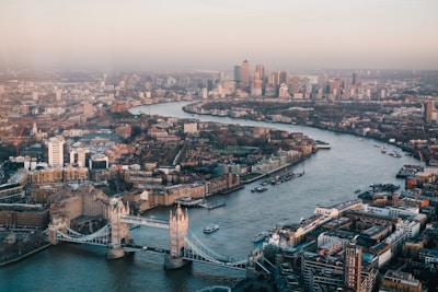
) %>Disable Preview
Set preview: false to disable the preview feature.
Code
<%= render HakumiComponents::Image::Component.new(
  src: "https://images.unsplash.com/photo-1513635269975-59663e0ac1ad?w=400",
  alt: "London - Tower Bridge",
  width: 200,
  preview: false
) %>
Nested in Modal
Image preview works correctly when nested inside a modal dialog.
Image Preview in Modal
Preview
Code
<%= render HakumiComponents::Button::Component.new(
  type: :primary,
  id: "open-modal-btn"
) do %>
  Open Modal with Image
<% end %>

<%= render HakumiComponents::Modal::Component.new(
  id: "nested-image-modal",
  title: "Image Preview in Modal",
  width: 600,
  open: false
) do %>
  <div style="text-align: center;">
    <%= render HakumiComponents::Image::Component.new(
      src: "https://images.unsplash.com/photo-1549144511-f099e773c147?w=500",
      alt: "Paris - Louvre",
      width: 400,
      id: "nested-image"
    ) %>
  </div>
<% end %>

<script>
  (() => {
    const button = document.getElementById("open-modal-btn")
    const modal = document.getElementById("nested-image-modal")
    if (!button || !modal) return

    const wire = () => {
      const api = modal.hakumiComponent?.api
      if (!api) return false

      button.addEventListener("click", () => api.open())
      return true
    }

    if (wire()) return

    const onRegister = ({ detail }) => {
      if (detail.id !== modal.id) return
      if (wire()) window.removeEventListener("hakumi-component:registered", onRegister)
    }

    window.addEventListener("hakumi-component:registered", onRegister)
  })()
</script>
Image API
| Prop | Type | Default | Description |
|---|---|---|---|
src |
String |
- |
Image source URL (required). |
alt |
String |
- |
Alt text for accessibility. |
width |
Integer or String |
- |
Image width. |
height |
Integer or String |
- |
Image height. |
fallback |
String |
- |
Fallback image URL shown on load error. |
placeholder |
Boolean |
false |
Show blur placeholder while loading. |
preview |
Boolean |
true |
Enable preview on click. |
preview_src |
String |
- |
Alternate (higher resolution) image for preview. |
**html_options |
Keyword args |
- |
HTML attributes merged into wrapper. |
Image.PreviewGroup API
| Prop | Type | Default | Description |
|---|---|---|---|
items |
Array |
- |
Array of image sources or hashes with src/alt keys. |
preview |
Boolean |
true |
Enable preview for the group. |
**html_options |
Keyword args |
- |
HTML attributes merged into wrapper. |
I18n Keys
The component uses Rails I18n for toolbar labels. Override via I18n config with scope hakumi_components.image.
| Prop | Type | Default | Description |
|---|---|---|---|
preview |
String |
"Preview" |
Preview button tooltip text. |
flip_vertical |
String |
"Flip Vertical" |
Flip vertical button tooltip. |
flip_horizontal |
String |
"Flip Horizontal" |
Flip horizontal button tooltip. |
rotate_left |
String |
"Rotate Left" |
Rotate left button tooltip. |
rotate_right |
String |
"Rotate Right" |
Rotate right button tooltip. |
zoom_out |
String |
"Zoom Out" |
Zoom out button tooltip. |
zoom_in |
String |
"Zoom In" |
Zoom in button tooltip. |
JavaScript API
Access via element.hakumiComponent.api
| Prop | Type | Default | Description |
|---|---|---|---|
open() |
Method |
- |
Opens the preview modal |
close() |
Method |
- |
Closes the preview modal |
zoomIn() |
Method |
- |
Zooms in the preview image |
zoomOut() |
Method |
- |
Zooms out the preview image |
rotateLeft() |
Method |
- |
Rotates the image 90° counter-clockwise |
rotateRight() |
Method |
- |
Rotates the image 90° clockwise |
flipX() |
Method |
- |
Flips the image horizontally |
flipY() |
Method |
- |
Flips the image vertically |
reset() |
Method |
- |
Resets all transformations |